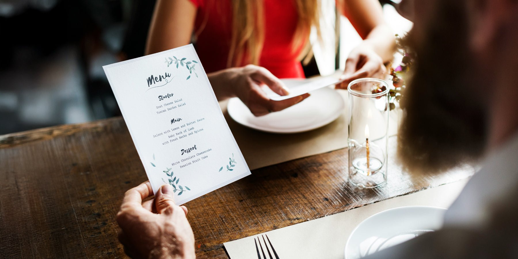
You know the feeling: you plop down on a lovely patio or sit down in a cozy restaurant, and before you've even decided what to drink, the menu is already in your hands. That moment is secretly quite important. Because a menu isn't just a list of snacks and drinks, but a tiny taste of the atmosphere you can expect.
A heavy leather card with subtle gold foil feels completely different from a cheerful, colorful card with playful illustrations. And that's precisely where the magic lies: the material, the weight, and the look and feel make you look at the same cappuccino or glass of wine differently. It seems small, but it immediately sets the tone.
Which style suits your place (and your guests)?
Whether you run a cozy lunchroom, an elegant restaurant, or a relaxed beach club, your menu needs to reflect the atmosphere you want to convey. Not just in appearance, but also in practicality. A menu in a busy lunchroom is consulted dozens of times a day, so it needs to be resilient. If you're serving a more elaborate dinner, it can feel a bit more luxurious and relaxed.
Location also matters. Do you have a lot of sun, wind, and sand around you? Then a map that can handle it is invaluable. And in a hotel restaurant, where people often wake up peacefully while choosing their breakfast, a slightly larger, clear map usually works better than a small, minimalist booklet.
A helpful tip: don't just consider what you like, but also how the menu fits into your interior. Finding inspiration is easy: browse online examples, like the menus from Publicamenucards , and ask yourself: does this suit my style and the people I want to welcome?

A layout that provides peace (and yes, hunger too)
A beautiful cover is nice, but the inside should be clear and concise. No one wants to search for the lunch special or signature cocktail. So: white space, clear headings, and a logical order.
Are you starting with coffee and cake because you're proud of it? Do that. Are cocktails the heart of your concept? Then don't let them get lost somewhere at the bottom, between soft drinks and juice. Small icons for vegetarian options, short descriptions, and a maximum of a few categories will help guests choose more quickly. The easier the choice, the more relaxed the dining experience will be. Win-win.
Fonts: beautiful is fine, but legibility is a must
We all love a bit of flair, but you also want your guests to be able to read the card without reaching for their phone lights. Elegant fonts are great for a title or the front cover, but a more subdued font works better inside. Especially with candlelight, mood lighting, or a sunset on your patio. Testing it in your own setting prevents surprises.
Storytelling on your map: let people taste with their eyes
Words mean much more than you think. "Crispy potatoes with rosemary and sea salt" sounds instantly cozy and delicious. "Potato garnish" feels less festive.
Your tone of voice can also simply suit your venue. A brunch café can certainly use a touch of humor. In a luxury restaurant, a more subdued, refined style works better. What more and more businesses are doing (and what's really fun) is adding a little story. A short introduction about your grandmother's homemade pastry, the local brewery you partner with, or that seasonal ingredient that's currently making you happy. This way, guests feel like they're stepping into your world.
Sustainable and practical: a card that stays beautiful
Menus take quite a beating: coffee splatters, sunburned fingers, kids' hands with ice cream, you name it. That's why it's smart to think about the finishing touches. Washable covers, sturdy card holders, or a system where you only replace the inside pages will save you money and reduce waste in the long run.
Sustainable doesn't have to be boring. Recycled paper in a beautiful, sturdy folder can actually add character. And the best part: you can easily switch it up with seasonal dishes or new specials, without having to print a hundred new cards right away.
Digital vs. physical: choose wisely for both
QR codes are handy (especially if you want to switch quickly), but many guests still prefer to hold a physical menu. The best solution is often a combination: a beautiful basic menu on the table, and a digital seasonal or drinks menu that you can quickly customize.
Just make sure it stays cohesive: the same colors, the same logo, the same vibe. Then it won't feel like you're living in two separate worlds, but rather one cohesive experience.
From first glance to last bite: your card does more than you think
The menu is part of the overall guest experience. Guests usually pick it up within a minute. That moment decides: does this feel like a place I want to stay? A menu that matches your ambiance, is comfortable to hold, and easy to read immediately inspires confidence.
And then the menu contributes to the rest of the evening: an extra drink, another dessert, or the thought "I want to come back here again." Without it becoming pushy, simply because everything is perfect.
Get started yourself (without stress)
Want to upgrade your menu? Start small. Show three options to a few regulars or your team and ask them what they think. Does it complement your chairs, your music, your lighting? And most importantly: does it bring a smile to your face?
From there, you can slowly build on it: better materials, a pleasant structure, and texts that you refresh from time to time. This way, your menu evolves along with your space. And it remains that quiet host who provides a warm welcome every day.


Interesting? Share with someone:
A maintenance-free lawn in your garden? Choose artificial grass.
Stylish women's boots: how to choose your new favorite pair